
Abstract
Background: The Agency for Health Care Research and Quality developed 14 prevention quality indicators (PQIs), including four PQIs related to preventable hospitalizations for diabetes and one to asthma. Quality indicators vary across counties, but variation over time has not been described.
Methods: The Kentucky Cabinet for Health and Family Services published PQI data for each county in Kentucky in each of the 3 years from 2006 to 2008. Variation and correlations among PQI measures were calculated.
Results: PQI rates often varied 10-fold between counties. Repeated measures of four PQIs were highly correlated, suggesting local health care processes that are stable over time. Some PQIs, such as PQI01—emergent complications of blood glucose control—correlated poorly with other measures. Other PQIs are correlated over geography and time, including PQI03 (long-term complications of diabetes); PQI14 (poorly controlled diabetes); and PQI15 (asthma).
Conclusions: These county PQI measures were stable over time. Stability implies that PQI measures were not the result of random processes and did not rapidly shift. However, some health improvement needs varied between counties. Although tailoring health promotion interventions to each county's needs may be complex, stable needs afford time to undertake targeted quality improvement efforts.
The Agency for Healthcare Quality and Research has derived a set of 14 prevention quality indicators (PQIs)1 from earlier efforts to identify preventable hospitalizations.2 These ambulatory care–sensitive conditions are “conditions for which good outpatient care can potentially prevent the need for hospitalization or for which early intervention can prevent complications or more severe disease.”3 Each PQI is defined by the presence and absence of selected hospital discharge codes from the International Classification of Diseases, Ninth Revision, Clinical Modification. A PQI event suggests that some unspecified primary care problem resulted in a preventable hospitalization. Therefore, some states monitor counties' PQI events to evaluate local access to quality primary care. County-level variation in PQIs could reflect variation in factors such as discharge diagnosis coding,4 comorbid illness, access to healthcare, patient behavior, and the quality of primary care services.5–7
PQI definitions are considered to have a high degree of face validity.8 Diabetes and asthma are two prevalent conditions for which adherent patients with access to good primary care should be able to prevent most hospitalizations. Four relatively unambiguous PQIs relate to diabetes care, and one indicator, PQI15, relates to asthma care.
Variation in local PQI rates should change in proportion to changes in the variation of underlying causes across place and time. Local risk factors related to soil, water, air quality, and industry affect health9–11 and usually change very slowly. Patient behavior is likely to change little over intermediate periods of time. Access to healthcare is important12 and likely to change slowly over time, although the arrival or departure of a single physician in an area with a shortage of primary care health professions could change access substantially.13,14 Physician behavior is relatively resistant to change,15 although physicians may respond quickly to meaningful feedback.16–18 Hospital discharge coding also involves local traditions that may change slowly until PQIs are published for hospitals.4 Thus, the most likely causes of PQI variation are resistant to change. We predicted that local variation in a given PQI rate would be small from year to year, resulting in a high correlation between repeated measures of a PQI rate within small areas.
Small area variation in PQIs over time has not been described. The Kentucky Cabinet for Health and Family Services, part of the executive branch of the state government, published PQI data for each Kentucky county for each year from 2006 through 2008.19 We analyzed these data to determine the correlation of asthma and diabetes PQI measures over time, correlation between measures, and variation between counties.
Methods
Summary data for each of the four diabetes PQIs and the single asthma PQI were obtained from published data for each of the 120 counties in Kentucky in each of the years 2006, 2007, and 2008.19 The data included the number of cases, county population, and crude annual incidence as a percentage of the population older than the age of 18 years. The Cabinet used the Agency for Healthcare Quality and Research Prevention Quality Indicator software version 4.0 (all patient refined data) to derive these risk-adjusted PQI rates from hospital billing records that contained patient demographics; International Classification of Diseases, Ninth Revision, Clinical Modification diagnoses; and source of admission information. Kentucky hospitals are required to collect and submit these data to the state; hospitalizations occurring out of state are not captured, so PQI rates may be higher, but not lower, than reported. The Cabinet adjusts PQI rates for patient severity (comorbidity) but not for education or income. The Cabinet calculated a 95% CI for the PQI rate in each county and flagged counties as having high rates if the lower bound of the 95% CI was higher than the 2004 national average. Similarly, it flagged counties as having low rates if the upper bound of the 95% CI was lower than the 2004 national average. The focus of this article is on risk-adjusted rates for the five indicators defined in Table 1, including four diabetes indicators and one asthma indicator.
List of Prevention Quality Indicators (PQIs)
Distributions of county PQI rates were inspected for outlier values and were tested for normality using the Shapiro-Wilks test.20 Correlation was assessed with the nonparametric Spearman's rho rather than the Pearson coefficient because risk-adjusted rates were not normally distributed.
Counties' published rates were recalculated to eliminate ties caused by rounding errors and were sorted. The recalculated rate data set had no tied values other than zeros. Variation between counties was visualized by generating box plots of risk-adjusted PQI rates. We produced box plots on a common axis ranging from zero to five per thousand, which encloses more than 90% of all observations for all PQIs.
We tabulated the number of counties reported to have “significantly higher” or “significantly lower” PQI rates than observed nationally in 2004. We generated a correlation matrix that included each recalculated risk-adjusted county PQI in each of the three years. We compared the nonparametric Spearman's rho test as a measure of correlation of each PQI with itself over time with every other PQI distribution. All statistical analyses were performed with JMP 5.01a software (SAS Institute, Cary, NC).
Results
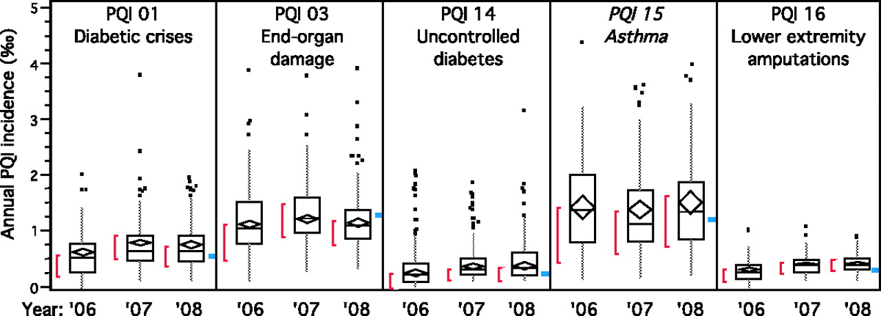
The box plots in Figure 1 illustrate most of the range of rates of all five PQIs, in each year, for the 120 Kentucky counties. The 10th to 90th percentiles for PQIs 1, 3, 14, and 15 vary across counties by a factor of at least 10 each year, eg, from 0.1 to 1 per thousand or from 0.4 to 4 per thousand. PQI16, lower-extremity amputations in diabetics, was the least frequent and varies by a factor of five or less.

Annual incidence of five prevention quality indicators (PQIs) in Kentucky counties. Each box plot represents the distribution of 120 counties' PQI rates in a given year, from 2006 to 2008. Outlier points are dots. Tenth and 90th percentiles are endpoints of the gray line. The 25th to 75th percentile range is enclosed by the box. The median is the dividing line in the box. The mean and standard error of the mean are indicated by the diamond within the box. The red external bracket ([) indicates the most densely located half of data points. The blue mark indicates the national average in 2004.
Figure 2 shows that many counties had PQI rates significantly higher (333 instances, 18% of observations) or lower (287 instances, 16% of observations) than the 2004 national average. In the extreme case of PQI15, one quarter of counties had high rates and one quarter had low rates. However, the number of high and low rate counties is relatively consistent within PQI from year to year.

Kentucky counties having prevention quality indicator (PQI) rates significantly different from the national average. High rate lines indicate the number of counties where the lower limit of the 95% CI for the local prevention quality indicator rate was higher than the 2004 national average. The low rate lines indicate the number of counties where the upper limit of the 95% CI was lower than the 2004 national average.
The heat maps in Figure 3 illustrate the consistency of PQI15 rates over geography and time. Each county is colored to indicate whether its rate is higher (red), comparable (yellow), or lower (green) than the national average. Over these 3 years, no county changed from red to green or from green to red.
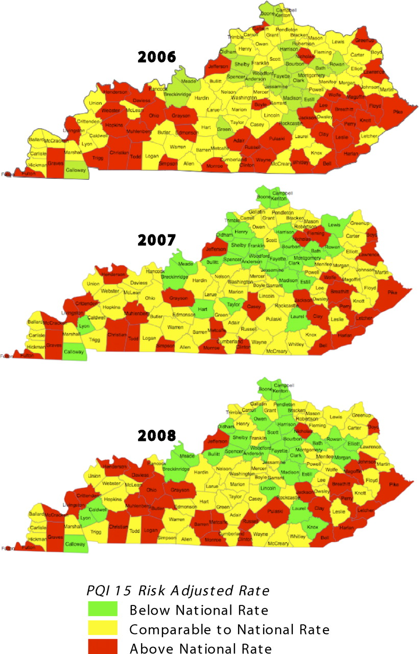
Serial prevention quality indicator (PQI) 15 (asthma) heat maps for Kentucky.
Table 2 lists Spearman's rho values for each pair of PQIs, where each rho is calculated from 120 pairs of county observations. PQI16 does not correlate well with any PQI, including repeated measures of itself over subsequent years. PQI01, representing emergent complications of blood glucose control such as ketoacidosis or coma, correlates best with itself over time. PQIs 03, 14, and 15 are most strongly correlated with themselves over time but also are significantly correlated with each other. Correlations between PQI 03, 14, and 15 are strongest within the same year and somewhat weaker across years.
Spearman's Rho Values for County-level Prevention Quality Indicators Rates Between Prevention Quality Indicator Measures and Across Time
Discussion
Substantial variation in health care activity between small areas has been documented in detail since the early 1980s,21 although much of this work has examined specialist care and invasive procedures. Variation in the quality of primary care received between areas as small as counties within a state is likely to be an equally ubiquitous finding, despite statewide health care policies that might tend to standardize care and outcomes (eg, Medicaid formularies and eligibility requirements). Bauer et al22 documented variation between Tennessee counties in preventable hospitalizations for asthma between 2004 and 2006. Variation in preventable hospitalization rates between Missouri counties was documented for asthma, chronic obstructive pulmonary disease, congestive heart failure, diabetes, and hypertension between 1998 and 2002.23
In the current study, we again found 10-fold variation between the top and bottom deciles of Kentucky counties in four of five measures designed to assess the quality of primary care services received by adults. The variation is clinically and statistically significant. Of the four measures with interesting variation, the three diabetic measures use relatively unambiguous billing codes for clinically distinct diabetic complications, limiting the likelihood that this is merely a coding phenomenon unrelated to medical reality. The Kentucky Cabinet for Health and Family Services reports that 18% of observations were “significantly higher” and 16% were “significantly lower” than 2004 national averages. The top and bottom deciles are therefore statistically different in each year.
The observed scale of variation may be typical. To our knowledge, a national distribution of county PQI rates has not been published. Kentucky counties' PQI rates could be representative of a broad distribution of rates across counties in other states. Similarities with PQI variation in Missouri and Tennessee suggest that these results are at least representative of that tristate region.
The variation is the result of stable processes in each county. The correlation matrix and heat maps confirm that, over 3 years, the same counties appear repeatedly in the top and bottom decile, or even quartile, of these PQI rates. Previous reports have pooled several years' data to avoid the instability of rates based on rare events.24 Only PQI16 was similarly unstable in the Kentucky data set. The four quality indicators having a 90th-percentile incidence of 1 per 1000 or greater were similar on repeated measures in ensuing years. This relative stability was similar for the unambiguous diabetes indicators and the potentially ambiguous asthma indicator, again suggesting that this is not merely a coding phenomenon but reflects reality. Although complete hospital discharge data can take a year to collect, such delays might not compromise the relevance of the indicators discovered. An intervention developed in response to a typically stable, commonly occurring quality indicator observed during one year could remain relevant for at least two more years.
The pattern of variation is not consistent across quality indicators. We again observe that a quality indicator for one disease, and even for a narrowly defined aspect of the management of a disease, is not necessarily predictive of another quality indicator. This is true even for indicators related to a common underlying disease process: only two of the four diabetes indicators correlate well with one another. This observation supports the hypothesis that quality improvement needs vary between counties.
Factors beyond the control of family physicians account for significant amounts of variation between small areas. In a study of Missouri counties, county level income, health care access, disease prevalence, and behavioral variables explained a moderately large fraction of variation.23 Poverty also explained a significant fraction of variation reported in Tennessee.22 The Kentucky dataset is distinctive in demonstrating that variation persists after correcting for the comorbidity of individual patients. Hospital discharge coding remains a potential contributor to variation. No studies to date have incorporated all these factors at once or any measure of physician behavior—such as prescribing patterns or process of care quality indicators (eg, distribution of glycosylated hemoglobin levels)—to explain variation in PQIs. A direct analysis of the relative contributions of these diverse factors would help focus attention on important and modifiable factors.
The correlation we observed between the asthma PQI and two diabetes PQIs may be explained in part by regional risk factors that are beyond the immediate control of family physicians. Physician attributes such as organization or personnel management skills could explain some of the correlated variation in PQIs 03, 14, and 15 because these all pertain to common issues in chronic disease management. If quality improvement needs include provider education, it could be efficient to target very specific topics in each county. However, PQI rates are inadequate to identify specific provider issues that contribute to high rates. Nevertheless, the stability of PQI rates over a 3-year period suggests that there is enough time to collect administrative data from hospitals in year 1, detect patterns and develop interventions in year 2, and deliver interventions that remain locally relevant in year 3.
Conclusions
Primary care quality indicators show significant and clinically important variation across counties, but each indicator may have a stable rate over time within a county. These attributes of quality indicators suggest suitability for directing narrowly focused primary care quality improvement activities, even if these require 24 months or longer to develop and deploy. However, a deeper understanding of quality improvement opportunities will be required to guide the efforts of potential intercessors.
Notes
-
This article was externally peer reviewed.
-
Funding: Financial support has been provided by the American Board of Family Medicine.
-
Conflict of interest: The authors are affiliated with the American Board of Family Medicine as a consultant (WS) and an employee (MDH).
- Received for publication January 28, 2011.
- Revision received April 12, 2011.
- Accepted for publication April 18, 2011.


