
To the Editor: The FDA requires that all pharmaceutical advertisements contain “information (on the drug's) side effects, warnings, precautions, contraindications … and effectiveness.”1 Unfortunately, such “prescribing information (PI)” is often in fine print and hard to read, just like the expiration dates on medicines.2 Yet, PubMed is silent on this topic.
Methods
We analyzed the PI legibility in the first 4 medical journals received in a clinic in June 2006: the Journal of the American Medical Association, the Journal of the National Medical Association, Cutis, and Patient Care. In each, we reviewed one editorial (containing a scientific article) and all PI pages for font size, line spacing, boldfacing, and paragraphing (good: paragraphs for titles and subtitles; limited: titles only; absent: none).
Results
There were 29 ads (mean 2.8 pages per ad: 1.2 pages per PI, and 1.6 pages per slogan-image). Mean font size was 6.6 (range 5–10; <8 in 26 PIs) for PIs versus 11 for editorial pages. Mean number of lines was 100 (range 54–141) per PI and 54 (range 45–57) per editorial page. Paragraphing was good in all editorial pages, and absent in 5, limited in 9, and good in 15 PIs. Boldfacing was absent in 2 (7%) PIs. One poorly legible PI had 9.4 times as many words as the editorial page (see Figure 1).
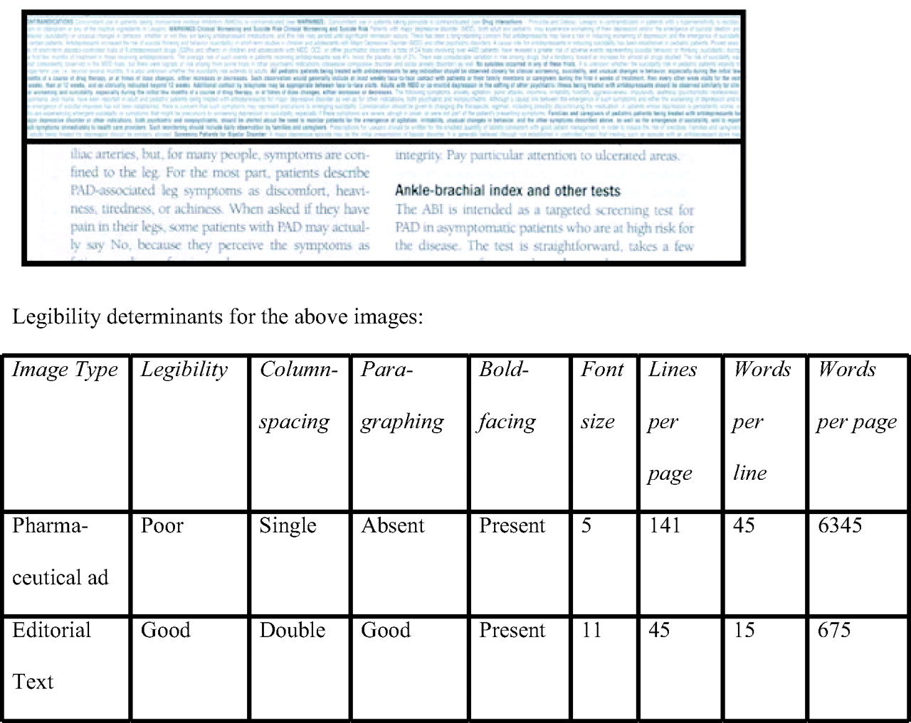
Comparison of the legibility of a prescribing information page from a pharmaceutical advertisement (top half) and an editorial page (bottom half). The actual-size images are from the same journal.
Discussion
Legibility was universally inferior in PIs compared with the editorial pages. This was due to word overcrowding (smaller fonts and reduced line spacing, boldfacing, and paragraphing). Advertisers probably employ this tactic to save ad space and cost. However, it backfires by rendering the PI uninviting to read, even more so for the 33% of physicians who have presbyopia.3
Our observations could be considered distorted because our sample size was small, nonrandom, and nonrepresentative of all available journals. However, we did not intend to determine the global magnitude of suboptimal PI legibility. Our goal was merely to highlight the hitherto unappreciated issue of suboptimal PI legibility; we believe that all printed material in scholarly journals should be readily legible. There was no selection bias as we neither deliberately chose nor serendipitously stumbled on journals with poor PI legibility. Our journals were of national circulation and had been published for >39 years. A flip-through review of 22 other journals in the clinic revealed that each of the 20 that carried pharmaceutical ads contained several PIs of suboptimal legibility.
Legibility of printed material depends on font size and style, line and letter spacing, boldfacing, paragraphing, and contrast.4 Acknowledging the significance of reasonable legibility, FDA has mandated a minimum font size of 8, title boldfacing, and adequate line spacing for prescription drug labels.4 For Pharmaceutical Marketing Applications, FDA recommends “Times New Roman 12 point.”5 No such criteria exist for PIs in journal ads—occasionally we miss the obvious! Our pilot study underscores a critical need to improve PI legibility via regulatory or industry action.
Printing of a legible PI would require additional space. The resultant increased advertising cost can, however, be readily offset by several benefits. Physicians would be delighted to read the PIs in the ads without having to search elsewhere. Publishers will not waste premium journal space on illegible PIs. Patients will be safer because a PI may serve as a safety-net against inaccurate ad claims.6 Advertisers will not squander millions of dollars7 on pages that do not get read. A legible PI may actually increase their drug's sales by making readers more knowledgeable. Should ad cost still remain a concern, space can be budgeted out of the ad's slogan-image pages. Alternatively, a condensed but legible PI may be published like that in a popular reference.8 Sometimes less may be more.


Jump to section
Related Articles
Cited By...
- No citing articles found.