Article Text

Abstract
Conceptual models are crucial for theorising, depicting and explaining population distributions of health inequities. This is because a visual conceptual model, like a map, can simultaneously organise and spur ideas and observations. Incorporating both imagery and metaphor, visual models not only illustrate key constructs and causal relationships specified by scientific theories but also provide an important tool for integrating and evaluating rapidly emerging findings and for guiding new research.
It therefore is instructive to consider and contrast different sets of images appearing in the public health, policy and popular literature pertaining to (1) social stratification, (2) determinants of population health and (3) determinants of health inequities. At issue is how different types of images illuminate, or obscure, the relevant causal processes that need to be altered to improve population health and reduce health inequities.
Of particular concern are conceptual confusions created when (a) models inaccurately depict the distribution of population and resources and (b) models of determinants of population health, rather than of determinants of health inequities, are used in discussions about social inequalities in health. Although perhaps a pragmatic argument can be made for use of less politically controversial imagery in policy-oriented documents, I would argue that the public’s health will be better served by an iconoclastic iconography, one that clearly and unequivocally delineates the social facts of skewed distributions of power and resources and depicts the societal processes that generate and maintain these distributions and their embodiment in population levels and distributions of health, disease and well-being.
Statistics from Altmetric.com
Conceptual models are crucial for theorising, depicting and explaining population distributions of health inequities.1 2 As in any field of science, visual display matters, not only for figures and graphs presenting key findings but also for explicating theory and for organising, comprehending and contesting scientific data and knowledge.1 3–7 The very etymology of “theory” links it to both vision and insight. Traced to its Greek roots, “theory” means to see inwards; to theorise is to use our mind’s eye systematically, following articulated principles, to discern meaningful patterns among observations and ideas.8
The value of visual conceptual models increases exponentially when research in an area is exploding, as is occurring with work on societal determinants of health and health inequities. In such circumstances, a picture is worth much more than 1000 words. This is because a visual conceptual model, like a map,3 can simultaneously organise and spur ideas and observations. Incorporating both imagery and metaphor, visual models not only illustrate key constructs and causal relationships specified by scientific theories1–7 but also provide an important tool for integrating and evaluating rapidly emerging findings and for guiding new research.
It therefore is instructive to consider and contrast different sets of images appearing in the public health, policy and popular literature pertaining to (1) social stratification, (2) societal determinants of population health and (3) societal determinants of health inequities. These different types of models, while distinct, nevertheless are related to the extent that societal conditions are, and are increasingly,1 2 9–15 posited to shape population levels and distributions of health. At issue is how different types of images illuminate, or obscure, the relevant causal processes that need to be altered to improve population health and reduce health inequities.
ICONOGRAPHIES OF SOCIAL STRATIFICATION
Literature on social stratification typically considers two linked aspects of society: social structure and the distribution of resources.15–17 Within this literature, one long-standing and important division involves (a) theories that see social structure and the distribution of resources arising from conflict between societal groups with competing interests (eg, social classes, racial/ethnic groups) versus (b) theories that depict social structure as a ranked hierarchy, a consequence of individuals possessing more or less of specified attributes or resources (eg, education, income).16 17
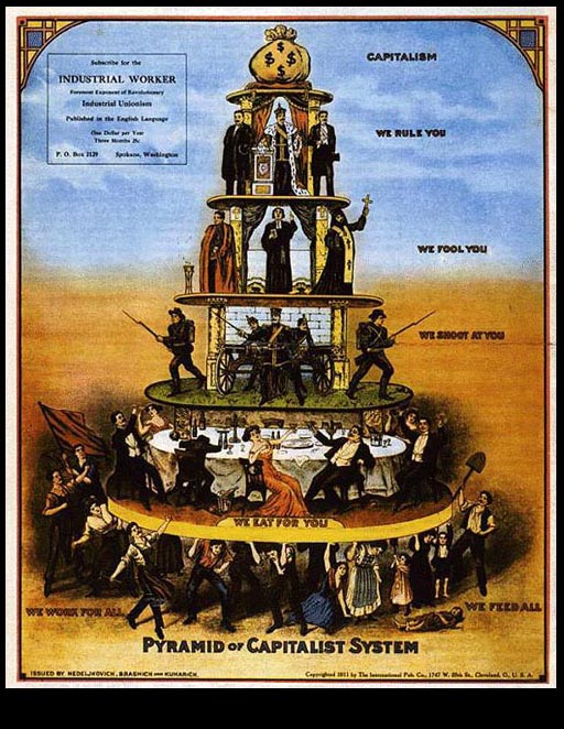
Exemplifying how visual conceptual models can sharply distinguish between contrasting frameworks are two distinct images, chosen because they present incompatible approaches to depicting social structure:
Fig 1A: the “Pyramid of the Capitalist System”, a well-known and widely reproduced image published by the Industrial Workers of the World in 1911,18 versus
Fig 1B: the ladder shown on the cover of a 2007 report titled “Reaching for a Healthier Life: Facts of Socioeconomic Status and Health in the U.S.”, produced by the John D. and Catherine T. MacArthur Research Network on Socioeconomic Status and Health, with the express intent of influencing US policy discussions.19

Whether or not one agrees with the analysis, in fig 1A, the social processes leading to stratification and the conflicting relationships between the different social groups involved are clearly depicted. The numerically largest group, the workers, identified as “we work for all” and “we feed all”, are placed at the bottom; they hold up all other social groups, with their burden depicted by both the hunched posture of several of the workers and also an ill child, lying on the ground, no longer able to work. The subsequent tiers, going from bottom to top, each including fewer and fewer people with more and more power, are the professionals and the petit bourgeois (“we eat for you”), the military (“we shoot at you”), the clergy (“we fool you”), the heads of state (“we rule you”) and, at the very top, a sack of money, representing “capitalism”.
By contrast, in Figure 1B, no social groups are depicted; instead, stratification is shown solely by a set of eight equally sized and equally spaced rungs on a ladder, with the rungs varying only in the number of apples they possess (from 0 to ¼ to ½ to 1 on up to 5). Making clear this “ladder” is intended to stand for the structure of society, the introduction to the report for which this image serves as a central motif (appearing not only on the cover but also elsewhere in the text) states:
Societies are structured like ladders. The rungs of the ladder represent the resources that determine whether people can live a good life – prosperous, healthy, and secure – or a life plagued by difficulties – insufficient income, poor health, and vulnerability. People standing on the top rungs are the best educated, have the most respected jobs, ample savings, and comfortable housing. On the bottom rungs are people who are poorly educated, experience long bouts of unemployment or low wage jobs, have nothing to fall back on in the way of savings, and live in substandard homes. The people in the middle have more resources to rely on than do people at the bottom, but far less than people on the top. In reaching for health, every step up makes a difference. [19, p 4; bold and italics in the original]
Further indicating the “ladder” is meant to be a universal phenomenon, the report also explains that “every society has its own ladder, but countries differ in how long and steep it is”.[19, p 5] Thus, depending on national policies, “some countries ensure that people at the bottom are provided with secure housing or a high quality education, even if they cannot afford to get it for themselves”, whereas “in other countries, little effort is made to distribute resources apart from what individuals can do on their own”.[19, p 5]
To the extent that images of social stratification and social structure are also meant to convey information about the joint societal distribution the population and resources, it is additionally instructive to consider images visualising stratification in relation to income or wealth. Three classic and widely influential examples, spanning from the early twentieth to twenty-first century, include:
Figure 2A: a graphical figure of the skewed curve of income distribution in the USA included in the classic article “Poverty and Health”,20 which was published in 1948 by C-E A Winslow, an international leader in public health, and which was based on a forceful presidential address he gave to the American Public Health Association, emphasising the need for government programmes to continue, not abandon, the New Deal approach of addressing poverty and its health consequences. In this article, Winslow wryly commented[20, pp 175–6] that
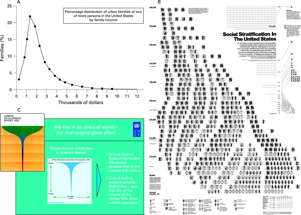
The first thing that strikes one is the extreme skewness of the graph with its peak at $1,000–1,500 and the enormous spread to the few families at relatively high income levels. It does not look like the normal graph of most biological phenomena.
He accompanied this figure with descriptive text offering a verbal metaphoric rendition of the distribution that uses the imagery of a field of crops, populated chiefly by extremely short scrawny plants, a few of moderate height, and a tiny number towering way into the sky (see Box 1);
Box 1 Visual description of income distribution in the USA, c. 1920: C-E A Winslow on “Poverty and Disease” (1948)[20, pp 176–7]
The description given by Karstens a quarter of a century ago is still not inapt. He said:
“The range of modern incomes baffles the imagination. It is impossible at the same moment to visualize the very small incomes of the great mass of families and the large fortunes enjoyed by a small handful of them. The variation is too great, both as to the size of incomes and the number of families.
Imagine a round field, one mile across, in every square foot of which one plant is growing. The plants, about twenty-two million in number, will represent approximately the families of the country, each plant for one family; and we can assume that the height of the plant indicates the annual income of the family, one foot for each thousand dollars, and that the tallest plants are clustered together in the center of the field. Let us start at the edge of this circular field and walk the distance of a half mile, to the center, observing the height of the plants which we pass on the way.
For more than three-quarters of our walk we can only speculate on the height of the plants we pass, for lack of any definite information from any source. If the tax-collector catches even the majority of those who have incomes of three thousand dollars or more, none of the plants thus far will reach up a yard from the ground. On the basis of the incomes he does report, however, we can make intelligent speculations, one of which is that the first half of our walk will be among plants puny and ill-nourished, reaching about our ankles. At 300 yards from the center we reach what is called the ‘upper tenth,’ the plants growing nearly to our knees. At 200 yards from the center they rise overhead ten feet from the ground, at 100 feet they reach up thirty feet, at 50 feet they tower a hundred feet high. At thirty feet from the center they climb to two hundred feet, at 15 to five hundred, at 9 to a thousand feet high. These last represent nearly 300 families whose income exceeds a million dollars a year. In the center of these, extending far out of sight about a dozen rise to heights of which we know little, except that they stretch at least a mile into the sky.”
From a practical standpoint, the message of the figures is clear. More than one-third of the non-farm families of two persons or more – a ‘third of the nation,’ had family budgets in 1929 below $1,500. Yet the minimum budget for decent subsistence for an average families was more than that amount … only above $2,000 could the family books balance …
… The disease of poverty affects a proportion not far from one-third of our population; and it bears acutely on the more than one-sixth of the population below the $1,000 level. Surely this is a problem deserving the very serious consideration of the health administrator.”
Fig 2B: an immediately iconic and pathbreaking image of distributions of US income and wealth by type of household (shown by occupations, gender, and race/ethnicity), as first generated in 1983 by Stephen J Rose,21 and most recently updated in 2007,22 with the new version appearing as a large colour poster that, like its predecessor, depicts how the bulk of the US population, especially of colour, is, as in other countries, concentrated in lower-income working class and impoverished households, whereas the bulk of the wealth is concentrated among a handful of enormously rich and high-income—and, in the USA, white—families;
Fig 2C: the now-classic 1992 figure of the “champagne glass” distribution of global income introduced in the United Nation’s Human Development Report 1992: Global Dimensions of Human Development,23 and updated in their 2005 report The World at the Crossroads,24 which shows that the vast majority of world’s income accrues to the upper income quintile (the “cup”) and only a tiny amount flows to the remaining four-fifths of the world’s population (the “stem”).
Although these three images differ on the extent to which they explicitly depict the sectors of the population at each income or wealth level, they all graphically show that high incomes and accumulations of wealth accrue only to a very small minority of the population; the vast majority of people, predominantly workers, are concentrated in the less affluent and impoverished strata. The parts of fig 2A–C thus are all are consonant with the “pyramid” depiction of fig 1A—and in sharp contrast to the equally sized rungs of the “ladder” depicted in fig 1B.
In this case, it is not just that the “pyramid” and “ladder” reflect different theoretical orientations regarding the causes and nature of societal divisions and stratifications, but that their representations of the empirical relationships between population and resources differ. Had the “ladder” been shaped like an upside-down V (ie, as “Λ”), with wider rungs on the bottom and converging side rails at the top, it would have more accurately reflected the distribution of the population in relation to the distribution of the resources shown. Although theoretical disagreements about societal structure and the causes of social inequality are to be expected, given ongoing debates in the literature,15–17 accuracy in depicting the empirical phenomena under discussion is essential.
ICONOGRAPHIES OF POPULATION HEALTH AND HEALTH INEQUITIES
Contrasting images likewise appear of determinants of population health and determinants of health inequities. This distinction is important because, as increasingly recognised in the public health literature,1 2 9–15 25 26 these two sets of determinants are not necessarily the same: what determines overall levels of population health may not be the same as what determines the magnitude of health inequities. It would thus be expected that figures concerned with the social determinants of health and the social determinants of health inequities would differ in the extent to which they depict inequitable societal relationships and refer explicitly to population distributions of disease and health inequities.
Consider, first, two images that portray the broader social determinants of health, appearing in publications oriented towards policy-makers:
Fig 3A: the highly influential and widely-cited figure of “Main determinants of health”, initially created by Dalhgren and Whitehead in 1993,27 as it appears in a 2006 report issued by the WHO Regional Office for Europe, titled “Levelling up (part 2): a discussion paper on European strategies for tackling social inequalities in health”.28 This graphic, chosen because of its widespread use and appeal, shows a series of layers, whereby a group of individuals, defined by their “age, sex, and constitutional factors”, are successively enveloped by a ring of influences, extending from “individual lifestyle factors” to “social and community networks” to “living and working conditions” on up to “general socioeconomic, cultural and environmental conditions”.
Fig 3B: an analogous model in the 2008 Robert Wood Johnson Foundation report on Overcoming Obstacles to Health,29 concerned with describing “social differences in health” and “applying current knowledge to reduce health disparities and improve health for all Americans”,[29, p 7] and chosen as an example of a document seeking to influence national policymaking about social inequalities in health. The graphic appears under the heading “Influences on Health: Broadening the Focus” and depicts “health” as the base upon which sit several concentric arches of different sizes: two small half-arcs, one labelled “medical care”, the other “personal behavior”, together nested within an arc labelled “living and working conditions in homes and communities”, which in turn is nested within an arc labelled “economic and social opportunities and resources”.

Both figures appropriately show broad domains of influences on population health. By using arches, both also convey that social factors are literally the overarching determinants of health. Both also appear in reports that carefully distinguish between determinants of population health and determinants of health inequities. However, although each figure can invite, and in each report is used to promote, consideration of social inequality as an important influence on population health, neither figure includes any overt reference to either social inequality, the societal processes that create social inequality, or the inequitable distributions of population health. Also interestingly absent are references to populations, time or place; instead, what is depicted are either individuals or “health” in the abstract. Thus, despite each figure serving as the conceptual model for reports concerned with, respectively, “health inequalities”27 and “health disparities”,28 the graphics focus on social determinants of health, not of health inequities. Had each report included not only text but also models distinguishing between social determinants of health and social determinants of health inequities, it would have lessened the likelihood of the former, by virtue of its visual primacy, being literally seen as sufficient to address the latter (which lacked a visual model).
Illustrating the difference when concerns about inequity are made explicit are images that dynamically locate health inequities in relation to societal inequities involving governance, power, class, gender, and racism. Three examples, appearing respectively in a US government report, an academic paper, and a WHO discussion paper, include
Fig 4A: a model from a 2003 report on Shaping a Vision of Health Statistics for the 21st century,30 issued by the US Department of Health and Human Services, and chosen because of its multi-agency genesis and determination to influence the scope of data collected by government for health statistics. In this model, “influences on population health” are conceptualised in relation to both the level and distribution of population health (featured at the centre of the figure), and hence explicitly delineated in relation to “place and time”, “context”, and “community attributes”, with the “political” and “cultural” context components explicitly including “discrimination”, “differential political enfranchisement” and “racism and sexism”.
Fig 4B: the ecosocial theory of disease distribution, which I introduced in 1994,1 as expressed in a visual conceptual model published in 200831 (building on an image initially developed in 200432)), and which is concerned with the myriad ways social inequality, including class, racial, and gender inequality, becomes biologically embodied, thereby creating health inequities, via the cumulative interplay of exposure, susceptibility, and resistance, at multiple levels, across the lifecourse. Concerned with core constructs needed to explicate the social and biological processes involved in shaping and perpetuating historically contingent patterns of health inequities, the image shows pathways of embodiment filtered through political economy and political ecology, in societal, historical, and ecologic context, while also calling attention to accountability and agency, both for social inequalities in health and for ways they are—or are not—monitored, analysed, and addressed.
Fig 4C: the 2007 framework of the World Health Organization Commission on the Social Determinants of Health (CSDH),33 a model chosen because of its potentially global implications for orienting work on health inequities. Akin to other models concerned with the political economy of health (eg, Benach et al 200734 and Navarro et al 200635), the CSDH model shows structural determinants of health inequities, including sociopolitical context and social structure, construed in terms of class, power, prestige, and discrimination, acting through intermediary determinants to “impact on equity in health and well-being”.

In contrast to fig 3A,B fig 4A–C overtly refers to health inequity and fig 4A,B additionally clearly places distributions of population health at the centre, refers to time, place and history, and includes the ecosystem. Moreover, the fig 4A–C clarifies that “social position”, and social inequality, are not a “given”, but are instead produced by societal processes2 15 that involve power and material resources, operating at different levels and in diverse domains. Agency is visible. These same strengths, however, can also be construed as weaknesses: fig 4A–C is complex, more so than the images presented in fig 3A,B. An open challenge thus remains as to whether models of determinants of health inequities can be rendered truly iconic, using visual imagery that readily sparks instant and vivid insight into the causal processes at play. That said, fig 4A–C, despite its shortcomings, nevertheless succeeds in making explicit that determinants of health inequities necessarily include issues of power, governance and social inequality.
As should be evident, the point of contrasting fig 3A–B with fig 4A–C is not that images regarding the determinants of population health are “wrong” and those pertaining to the determinants of health inequities are “correct”. Instead, the argument is that they are different and cannot substitute for each other. While perhaps a pragmatic argument can be made for use of less politically controversial imagery in policy-oriented documents,36 it nevertheless remains problematic when reports focused on health inequities present conceptual models pertaining only to the social determinants of health and do not also include models regarding determinants of health inequities.
THE POWER TO REVEAL OR TO CONCEAL: ICONOGRAPHY AND ACCOUNTABILITY
In summary, the visual depiction of health inequities and their societal determinants matters: for explanation, accountability, and action. At a time when ever more evidence1 2 11–15 19 25–35 shows that the shorter sicker lives of people burdened by economic deprivation, discrimination, noxious jobs, and environmental pollution result from injurious political priorities, not individual failure, clarity in the conceptual models used to represent health inequities and the social divisions that underlie them is essential.
A commitment to accuracy, and to producing effective actionable knowledge, requires use of conceptual models that reveal, not conceal, who and what is accountable for social inequalities in health.1 31 Precisely because of the power of visual imagery, the iconic imperative for work concerned with analysing and addressing health inequities is to employ models that graphically depict health inequities and their determinants and also accurately delineate the distributions of populations, resources, and health at issue. When it comes to analysing and identifying solutions to health inequities, health professionals, policy-makers and the public at large will best be served by an iconoclastic iconography, one that clearly and unequivocally delineates the social facts of skewed distributions of power and resources and depicts the societal processes that generate and maintain these distributions and their embodiment in population levels and distributions of health, disease and well-being.
What this study adds
This paper provides a novel analysis of the iconography of health inequities, a topic not previously addressed in the literature on social inequalities in health.
It analyses images appearing in the public health, policy, and policy literature pertaining to (1) social stratification, (2) determinants of population health, and (3) determinants of health inequities, and highlights problems created when (a) models inaccurately depict the distribution of population and resources, and (b) models of determinants of population health, rather than determinants of health inequities, are used in discussions about social inequalities in health.
Policy implications
The paper argues that while perhaps a pragmatic argument can be made for use of less politically controversial imagery in policy-oriented documents, in the author’s view the public’s health will be better served by an iconoclastic iconography that clearly and unequivocally delineates the social facts of skewed distributions of power and resources and depicts the societal processes that generate and maintain these distributions and their embodiment in population levels and distributions of health, disease and well-being.
Footnotes
Competing interests: None.
Author contributions: NK, as sole author, conceptualised, researched, and wrote the article.